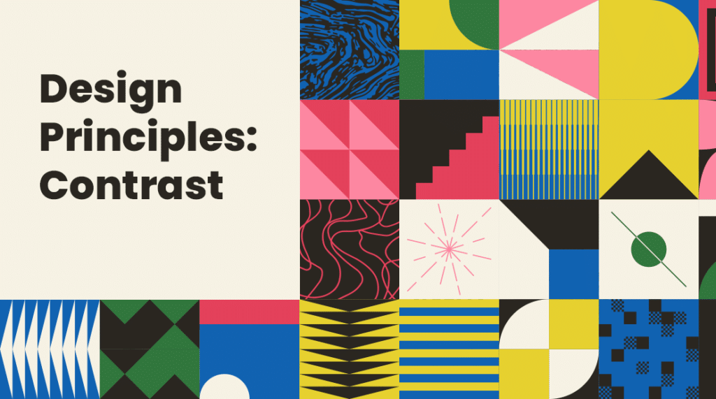
Contrast can be used to create variety, visual interest and emphasize drama in design. This design principle refers to the positioning of opposite elements and effects. The idea around difference is the graphic details that distinguish the main subject from other details in the background. By using light and dark colors, smooth and rough textures, large and small shapes can represent an example of contrast.
Contrast grabs attention and creates an impression that is more likely to stand out and hold the viewers’ curiosity. When contrast is organized, it clarifies the purpose of your design and enhances the appeal by creating a visual order—focal points in contrast help to highlight your design and make the main subject pop.
Color:
Contrast is a common way to incorporate by using color. When using complementary colors like blue and orange will have high contrast. While harmonious colors like yellow and green will have low contrast. The use of high contrast or complementary colors can be eye-catching, and contrary to popular belief, it doesn’t have to strain the view. If your design uses harmonious colors, you can create a bit more edge by adding tints (white) and shades (black). Establishing the right balance when using contrasting colors is key to creating an attractive and practical design.
Size:
When using size to create contrast, it helps to establish the critical elements in your design by leading the eyes towards more essential details. More prominent design elements, that are larger, are naturally accentuated and are more likely to catch attention than a minor element.
Shape:
If your design contains a lot of circular elements, set your focal point in a square border. Shapes can play off each other to create contrast when their characters are free-flowing versus structured or raised versus flat.
Text:
The adding contrast to text, if the design permits, use different colors for titles and headings. Try using all caps for titles and headings to make them stand out from the body. A good rule of thumb is to choose one serif font and one san serif because this combo adds the right amount of contrast.
Be strategic in your visuals, follow the design principles of contrast, and you are sure to create unique visual designs! At Super Color Digital, we are more than just a printer. We work directly with our clients to transform their digital designs into eye-catching realities.