Have you ever heard the phrase “three is a magic number”? In design, it could not be more accurate. The rule of thirds is a design technique that can help you layout your design. The primary function of the Rule of Thirds is to help create an asymmetric design. This is because when the design is centered and too balanced, it becomes boring.
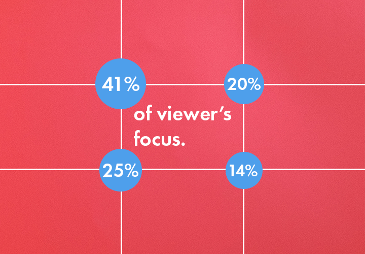
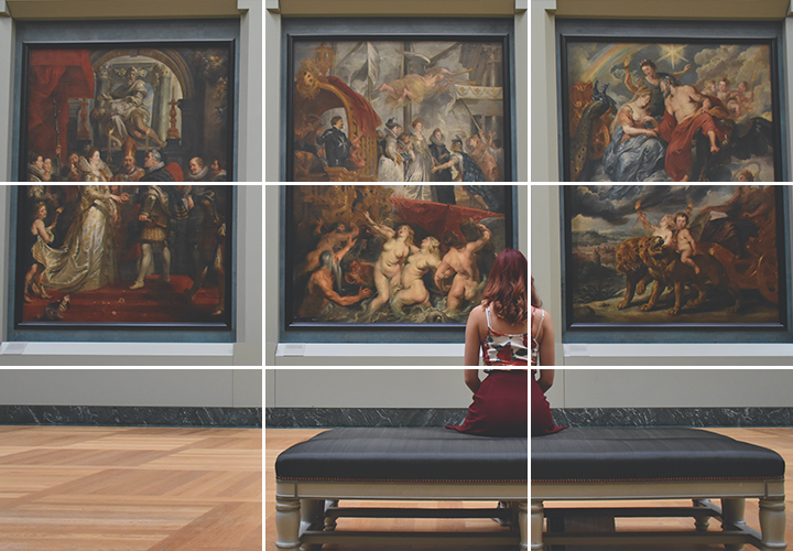
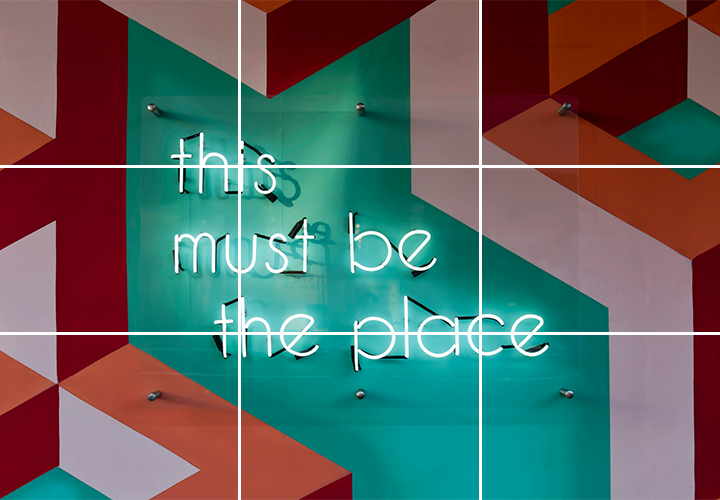
Designers use the rule of thirds as an effective way to bring a complete sense of visual balance to their design. The idea is straightforward by overlaying a grid divided equally into thirds, both horizontally and vertically. Keep in mind that the intersecting points are known as focal points, and each point of intersection is a potential point of interest. As a result, more important elements should be placed near these intersecting points. When aligning your main subject, more minor details should accompany it to create a well-balanced and visually exciting design.
The rule of thirds technique can help improve any design layout by suggesting where key elements may look their best. Using this method makes your design look more consistent, balanced, and artistically pleasing. This is because viewers’ eyes are naturally moving around the design.
By following the rule of thirds, you are sure to create an amazing visual design! At Super Color Digital, we are more than just a printer. We work directly with our clients to transform their digital designs into eye-catching realities.