In large format printing, color is not just aesthetic it is brand integrity.
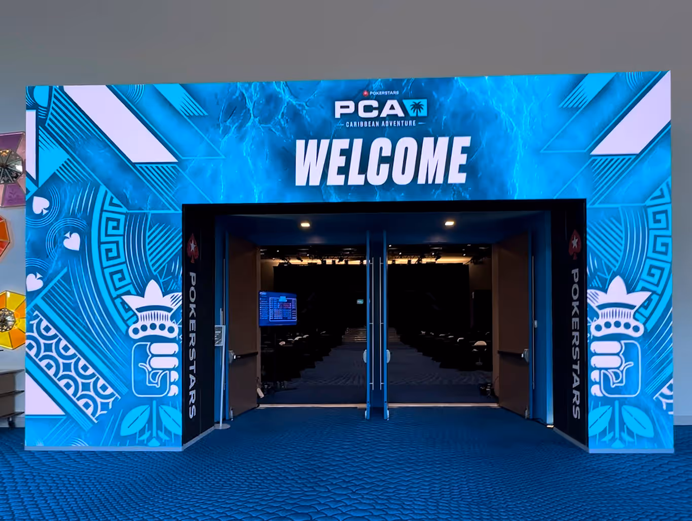
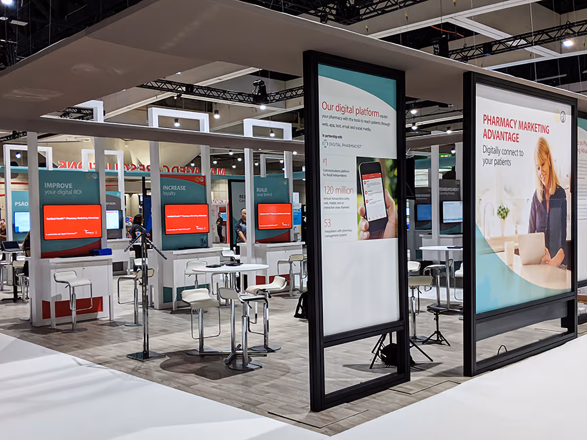
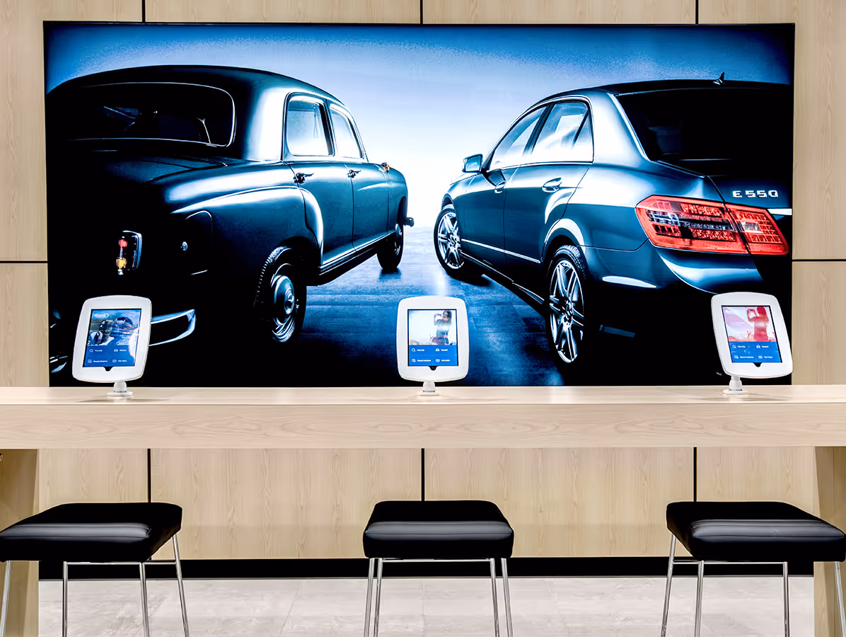
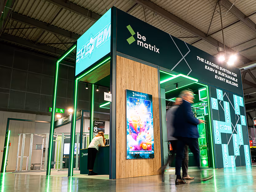
When a company invests in environmental graphics, retail displays, trade show booths, or corporate interiors, every shade must reflect the brand accurately. A slight variation in tone or saturation can shift perception, weaken consistency, and reduce impact.
That is why color calibration is critical in professional large format production.
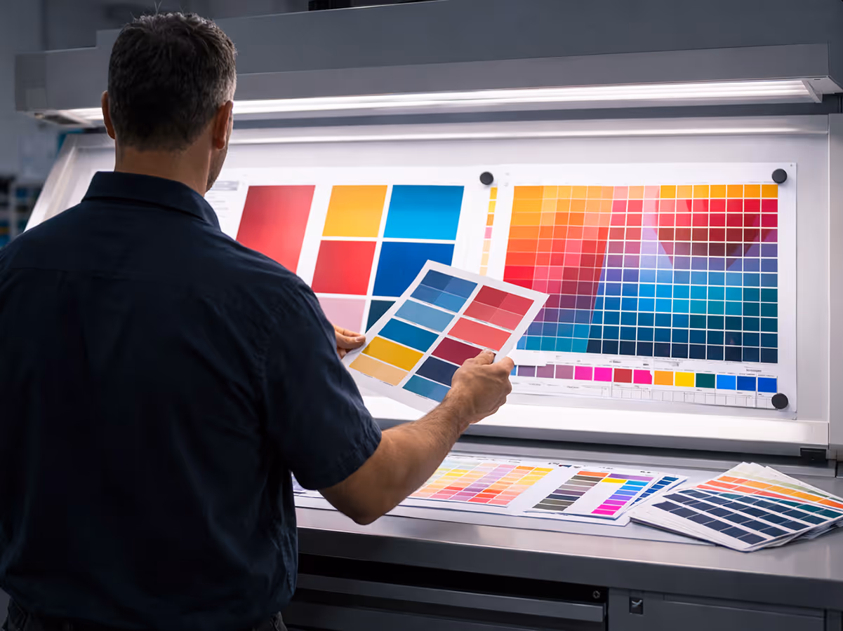
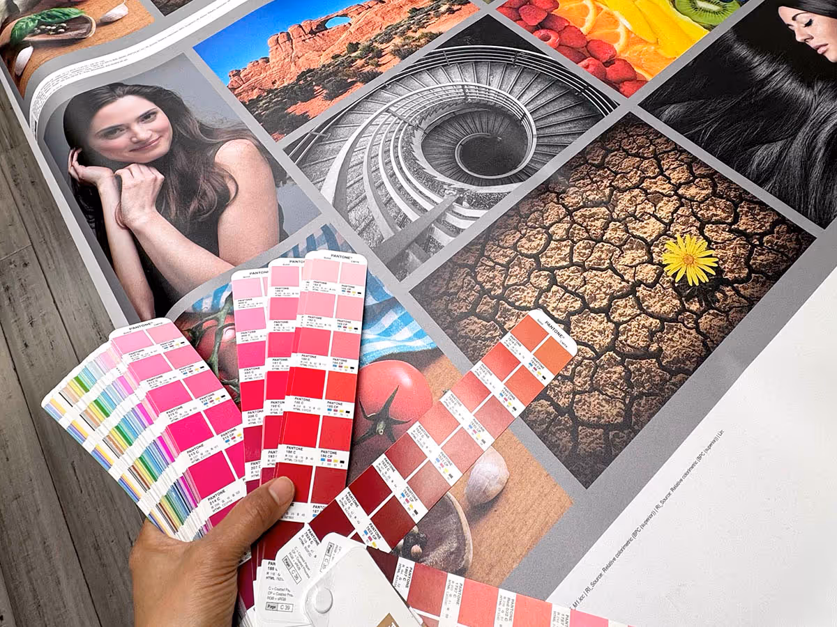
Brand guidelines are precise for a reason. Specific Pantone references, CMYK values, and color ratios are designed to create recognition and trust.
Without proper calibration:
In large format applications where graphics are magnified across walls, windows, or structures these inconsistencies become even more visible.
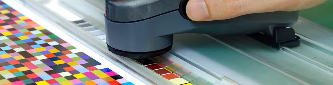
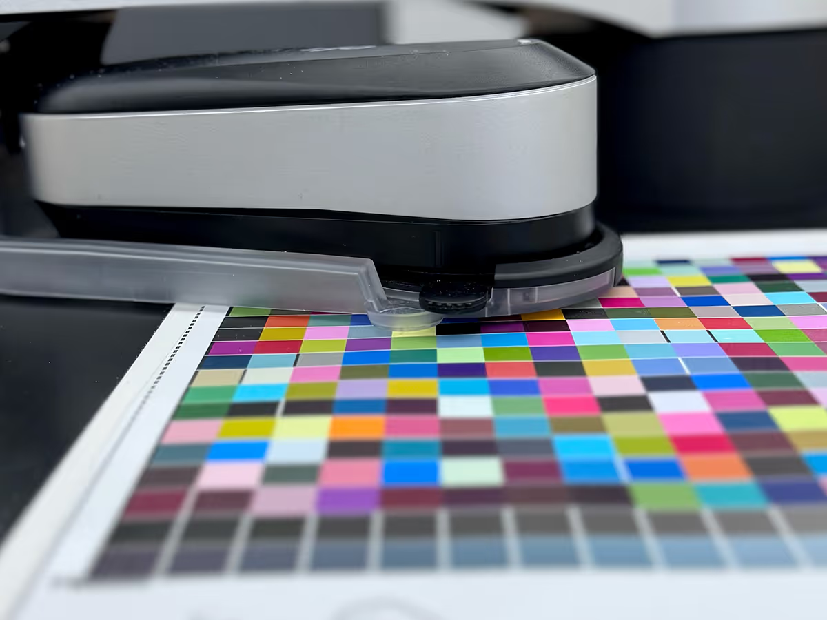
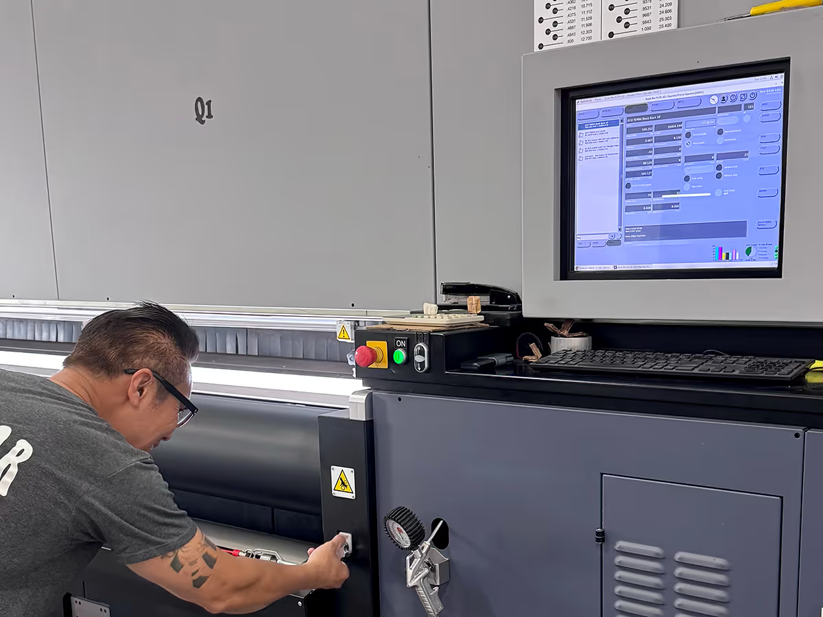
Color calibration in large format printing ensures that what is designed on screen is accurately reproduced in print.
This process includes:
Calibration is not a one-time adjustment. It is an ongoing process that maintains consistency across materials, finishes, and environments.
Partner with Super Color to ensure consistent brand color across your next project. Our large format printing solutions are designed to deliver precise color accuracy, exceptional clarity, and reliable consistency from concept to installation.


Bringing bold ideas to life through print and digital design.